Emma Kalayjian
Menu
Emma Kalayjian
Menu
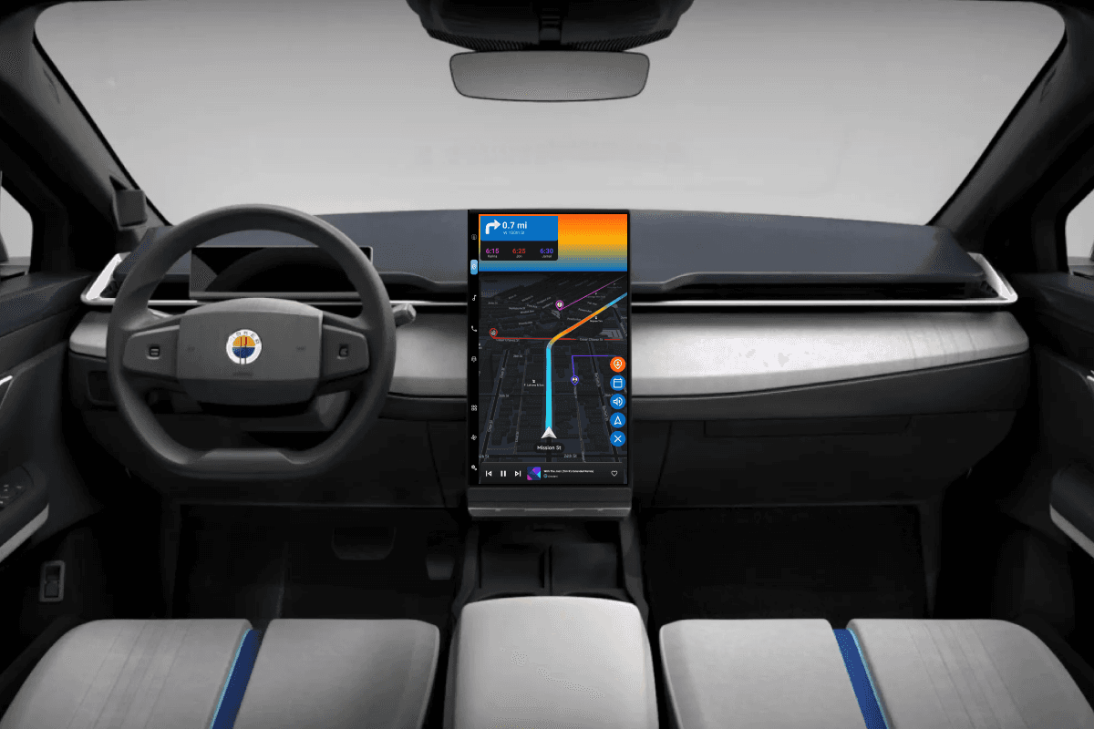
Colorblind-friendly UI + VUI to reduce cognitive load.
Fisker Ocean User Interface

Colorblind-friendly UI + VUI to reduce cognitive load.
Fisker Ocean User Interface

Colorblind-friendly UI + VUI to reduce cognitive load.
Fisker Ocean User Interface
About
Full presentation available on Behance.
This project is intended to enhance the driving experience for Fisker by introducing a Driving Experience mode that adds in a sense of playfulness and adventure for drivers looking to capture the "top-down, driving down Pacific Coast Highway" feeling every day. We do this by enhancing functionality, thereby decreasing smartphone dependence, and implementing a single color palette that is accessible for all users with any kind of color related visual impairment.
Awards
Tools
Google Forms (full survey here)
Mural (research findings here)
Figma (designs here)
ProtoPie (prototype here)
Google Forms (full survey here)
Mural (research findings here)
Figma (designs here)
ProtoPie (prototype here)
Google Forms (full survey here)
Mural (research findings here)
Figma (designs here)
ProtoPie (prototype here)
My Contributions
Research, Design, Prototyping
Research, Design, Prototyping
Research, Design, Prototyping
Company
Fisker Inc. (inspired) - Art Center College of Design Extension Program
Skillset
UI Design, VUI Design, Accessible Design
Timeframe
September 2023 - January 2024
Team
Emma Kalayjian (solo project)
Problem
When designing an interface for a moving product, such as a car, it's crucial that the user is able to rely on a single source of information and be able to access it in multiple ways, while achieving the desired result in the most efficient manner possible.
There's 3 major problems that I've identified:
Users are not able to access enough information through the in-car interface, so they toggle back and forth between the car and their phone throughout their journey.
Majority of information is only available visually, with no vocal feedback from a voice assistant.
Even then, most of this information depends on color, which may not be accessible for colorblind users.
Questions
How can a new driving mode help decrease smartphone dependence?
How can this driving mode enable greater efficiency, usability, and overall satisfaction?
Is it possible for a singular color palette to be accessible and usable for all colorblind users?
How can a new driving mode help decrease smartphone dependence?
How can this driving mode enable greater efficiency, usability, and overall satisfaction?
Is it possible for a singular color palette to be accessible and usable for all colorblind users?
How can a new driving mode help decrease smartphone dependence?
How can this driving mode enable greater efficiency, usability, and overall satisfaction?
Is it possible for a singular color palette to be accessible and usable for all colorblind users?
Process
Conducted and published an online User Research survey to collect both qualitative and quantitative feedback.
Subsequently, the raw data was aggregated and synthesized to illustrate the findings.
From there, the research suggested that a new Drive Mode that better supports road trips (mainly navigation, communication, and music) would support all 3 earlier identified problems.
Next, a persona was created to better understand the user needs. Market research was also performed to better understand the competitive product landscape.
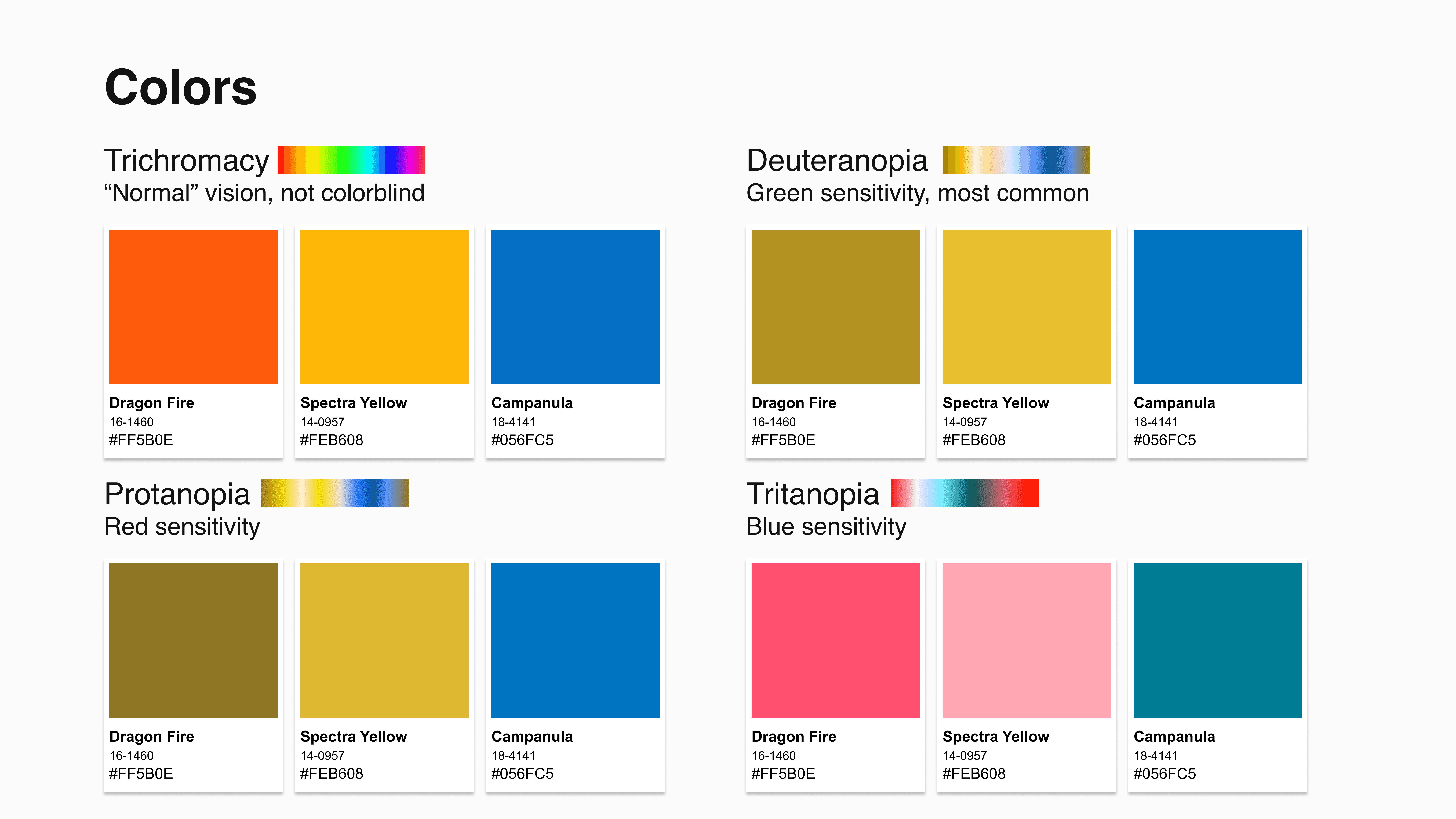
For design, vision boards were then created to draw inspiration for the UI. This then inspired the color palette, which was then tested for multi-level colorblindness accessibility.
Once that passed, the information architecture was created, followed by wireframes, LoFi mockups, then HiFi mockups.
Penultimately, the high fidelity designs were imported to ProtoPie for motion design, prototyping, and voice UI design.
Finally, the full prototype was available.
Highlights
4 unique Drive Modes identified
1 singular on-brand, colorblind friendly color palette
6 new, engaging features, including VUI integration.
4 unique Drive Modes identified
1 singular on-brand, colorblind friendly color palette
6 new, engaging features, including VUI integration.
4 unique Drive Modes identified
1 singular on-brand, colorblind friendly color palette
6 new, engaging features, including VUI integration.



From top to bottom: Research Synthesis, Persona, High Fidelity Screens, Wireframes.
From top to bottom: Research Synthesis, Persona, High Fidelity Screens, Wireframes.


From top to bottom: Vision Board, Color Palette, Information Architecture Map
From top to bottom: Vision Board, Color Palette, Information Architecture Map
Conclusion
This distinctive Drive Mode is packed with features, including a powerful voice assistant and a range of enhancements for Navigation, Music, and communication. Cruise Mode allows drivers to stay fully engaged with the road while minimizing smartphone use. Moreover, it offers a color palette that is both on-brand and colorblind-friendly, ensuring a consistent and enjoyable sunset display in the UI for all drivers.
This distinctive Drive Mode is packed with features, including a powerful voice assistant and a range of enhancements for Navigation, Music, and communication. Cruise Mode allows drivers to stay fully engaged with the road while minimizing smartphone use. Moreover, it offers a color palette that is both on-brand and colorblind-friendly, ensuring a consistent and enjoyable sunset display in the UI for all drivers.
This distinctive Drive Mode is packed with features, including a powerful voice assistant and a range of enhancements for Navigation, Music, and communication. Cruise Mode allows drivers to stay fully engaged with the road while minimizing smartphone use. Moreover, it offers a color palette that is both on-brand and colorblind-friendly, ensuring a consistent and enjoyable sunset display in the UI for all drivers.
Impact
This project received a resounding "A" for the final grade, and started a larger conversation about incorporating accessibility into the curriculum at Art Center.
This project received a resounding "A" for the final grade, and started a larger conversation about incorporating accessibility into the curriculum at Art Center.
This project received a resounding "A" for the final grade, and started a larger conversation about incorporating accessibility into the curriculum at Art Center.
More projects
When engineers and designers harmonize.
NASA JPL Autonomy Testbed Paper
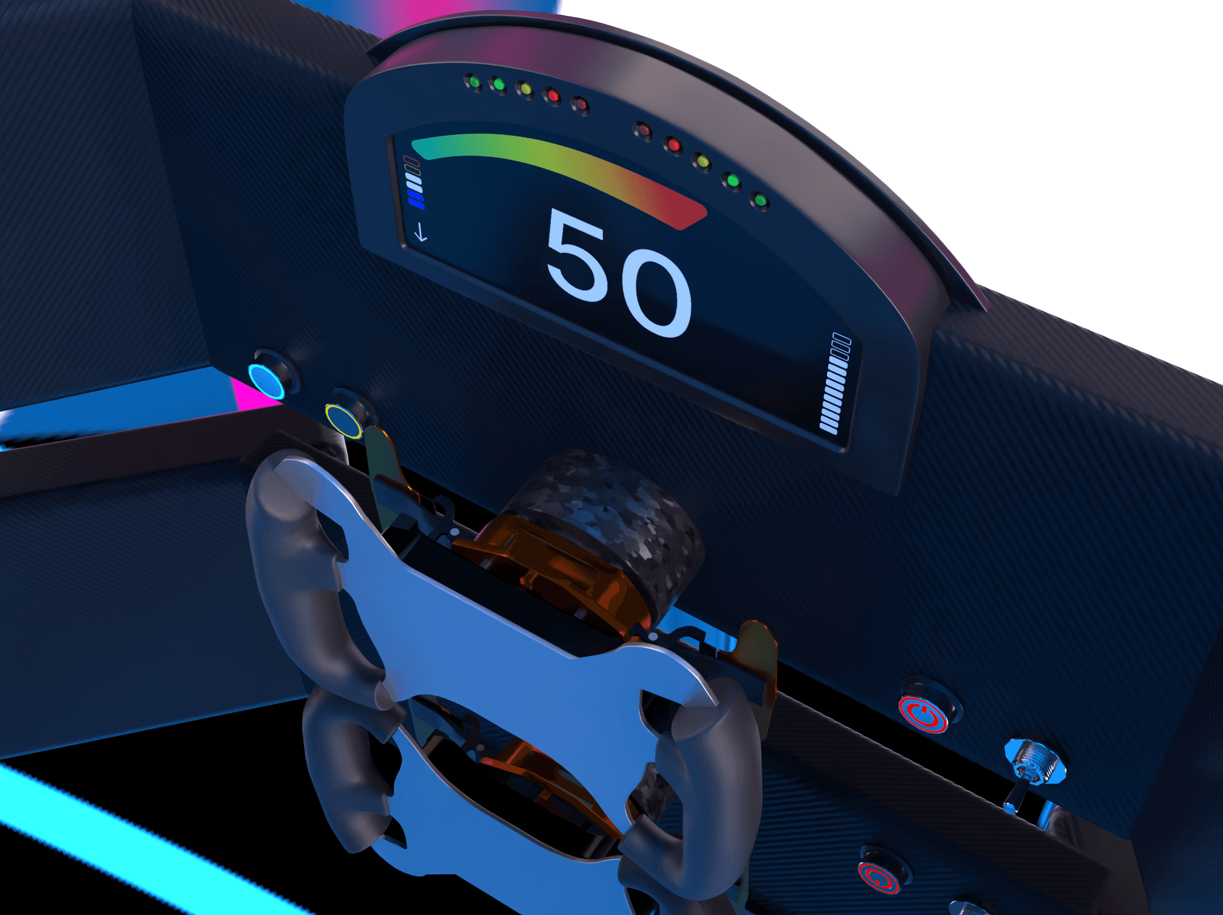
A racecar with a designer dashboard.
Formula Racecar HMI & UI

When engineers and designers harmonize.
NASA JPL Autonomy Testbed Paper

A racecar with a designer dashboard.
Formula Racecar HMI & UI
Contact
Let’s start a conversation
Contact
Let’s start a conversation
Contact
Let’s start a conversation