Emma Kalayjian
Menu
Emma Kalayjian
Menu
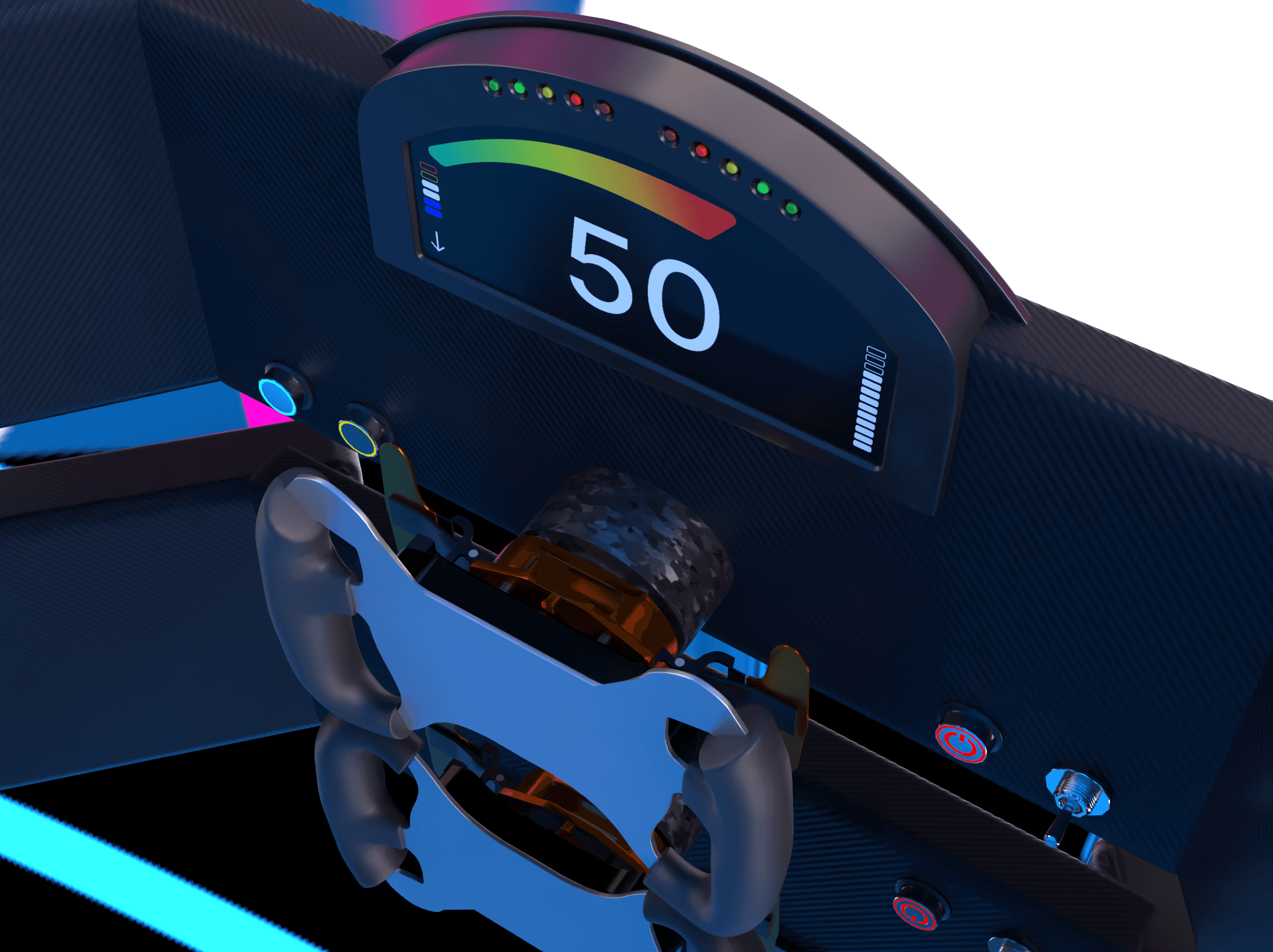
A racecar with a designer dashboard.
Formula Racecar HMI & UI

A racecar with a designer dashboard.
Formula Racecar HMI & UI

A racecar with a designer dashboard.
Formula Racecar HMI & UI
About
Full presentation available on Behance.
Formula Society of Automotive Engineers is an international collegiate organization that's dedicated to researching, designing, testing, and competing an open-wheel race car, built and funded from scratch.
My design contributions as a team member included researching and partly designing the dashboard for the 2018 car, which I've since revisited in 2024 to reflect today's skillset and implementation of more recent tools.
Awards
FSAE Michigan Design Finalist
FSAE Michigan Design Finalist
FSAE Michigan Design Finalist
Tools
Adobe Dimension, Blender, Pen & Paper, Adobe PhotoShop, Google Docs & Sheets
Adobe Dimension, Blender, Pen & Paper, Adobe PhotoShop, Google Docs & Sheets
Adobe Dimension, Blender, Pen & Paper, Adobe PhotoShop, Google Docs & Sheets
My Contributions
UX Research, HMI Design, Interaction Design, LoFi & HiFi Design, Prototyping, User Acceptance Testing, Systems Integration Testing, Design Collaboration with Engineering
UX Research, HMI Design, Interaction Design, LoFi & HiFi Design, Prototyping, User Acceptance Testing, Systems Integration Testing, Design Collaboration with Engineering
UX Research, HMI Design, Interaction Design, LoFi & HiFi Design, Prototyping, User Acceptance Testing, Systems Integration Testing, Design Collaboration with Engineering
Company
Formula Society of Automotive Engineers
Skillset
HMI Design, UI Design, Collaboration with Engineering
Timeframe
2017 - 2018, 2024
Team
Emma Kalayjian, Matthew Hush, Richard Herrera, Brian Helt, Darshan Bagivalu, Timothy Newbold II, Bryan Doney, Kevin Wong, Garrett Salmi, Kimberly Ramirez, Ulysses Sanchez, Owen Wilkening, David Hernandez, Ricardo Gonzalez, Tim Heiderer, Albert Lin, Christopher Lugo, Ignacio Saldivar, Rachel Hansen, David Martinez, Christian Posada, Cristofer Mayers, Nevada Chovan, David Martinez, Craig Rutty, Brian Helt, Kevin Valencia
Problem
In a culture prioritizing efficiency over intuition, reviewing the Human Machine Interface (HMI) offered a chance to push performance beyond conventional engineering limits by optimizing driver response times and reducing cognitive load.
In a culture prioritizing efficiency over intuition, reviewing the Human Machine Interface (HMI) offered a chance to push performance beyond conventional engineering limits by optimizing driver response times and reducing cognitive load.
In a culture prioritizing efficiency over intuition, reviewing the Human Machine Interface (HMI) offered a chance to push performance beyond conventional engineering limits by optimizing driver response times and reducing cognitive load.
Questions
Instrument Panel
With the driver being in an outdoor environment with sunlight, will this cause the instrument panel's reflective properties to impair the driver's vision?
If so, should this be painted with Vantablack to prevent any glare?
Steering
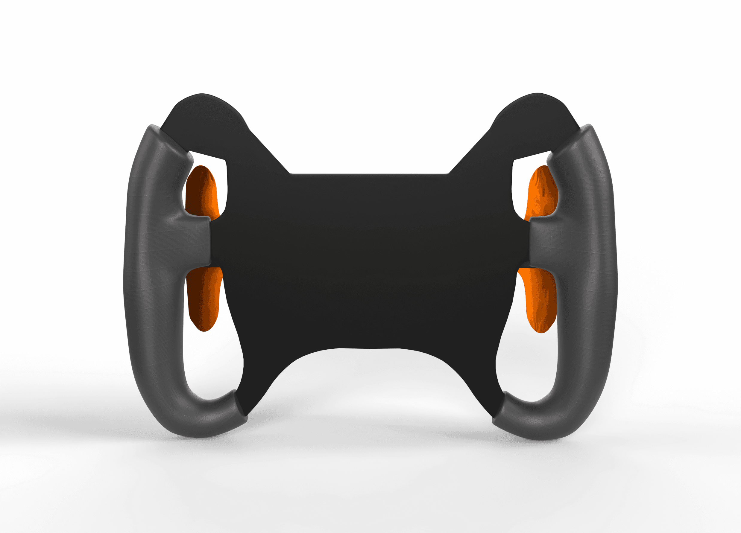
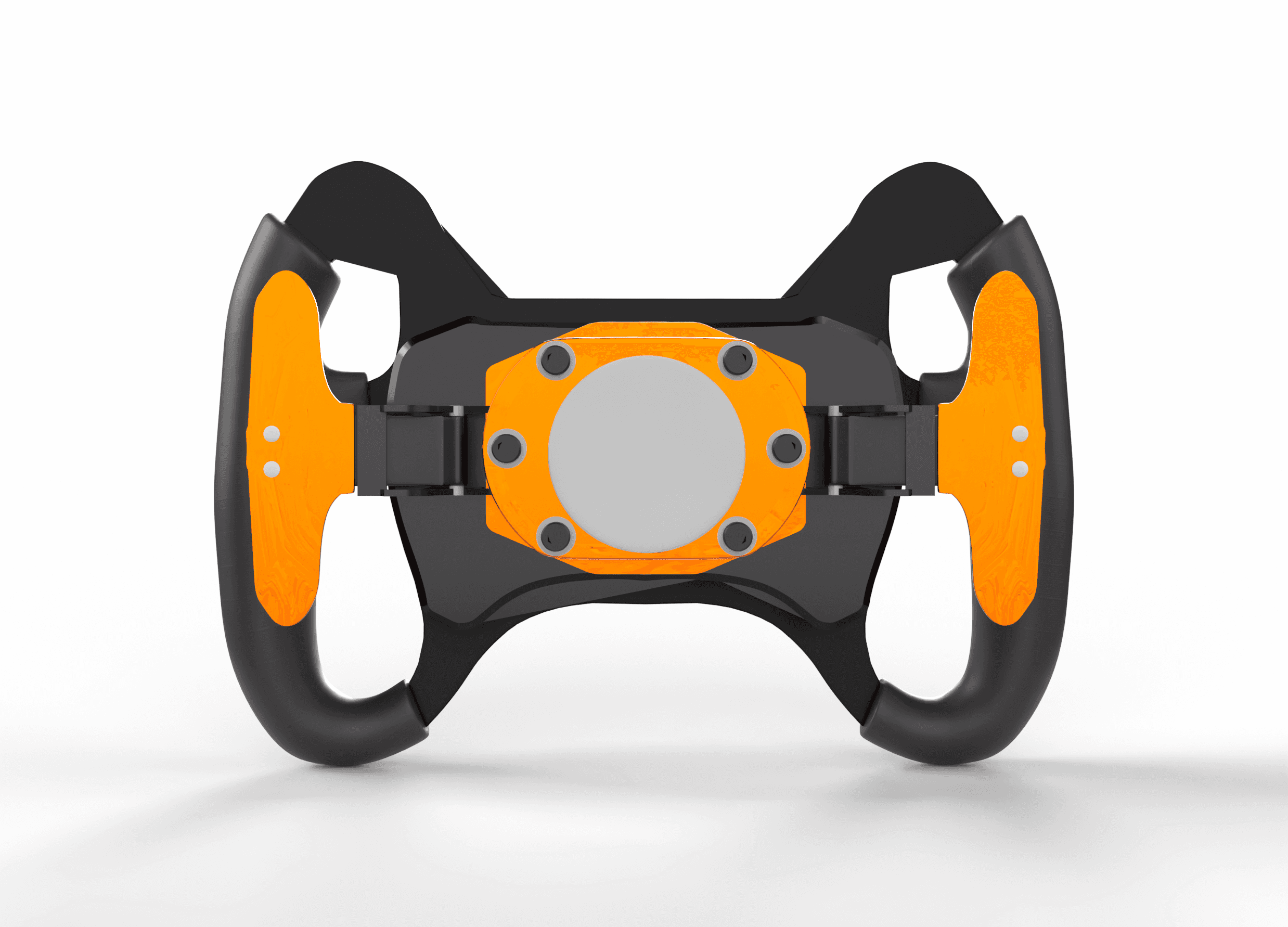
Between partial (F1 style) or full handles, which design provides better grip?
Similar to F1, can/should the steering have any controls or screen on it? Would this have any impact on ingress/egress?
Controls
Between a toggle or a button, which interaction point is the most intuitive for each control?
For the outdoor environment paired with the darkened vision from the race helmet, should the buttons be backlit in various colors along with the text label to provide faster recognition?
What data does the driver need to see dynamically and visually?
Graphical User Interface (GUI)
What data does the driver need to see dynamically and visually?
Does an LCD or LED display prove more optimal for the outdoor environment?
Process
Research
Studied past HMI layouts from our earlier vehicles and comparing them to popular Formula 1-4 layouts
Performed driver surveys and interviews with both current and past team members who were our drivers at these competitions
Searched our vendors’ inventories to view product details of various components (buttons, screens, etc.)
Design
Low fidelity (LoFi) sketches with product references from vendors’ inventories
Participated in part of the Engineering Design Review process: Mission Concept Review (MCR) & Preliminary Design Review (PDR)
Testing
Created research plan for User Acceptance Testing
Performed A/B Testing to test two final HMI designs to measure driver response times under various scripted scenarios
Performed User Acceptance Testing to analyze ergonomic performance (ingress + egress) of final HMI design
Highlights
Instrument Panel
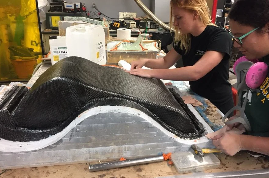
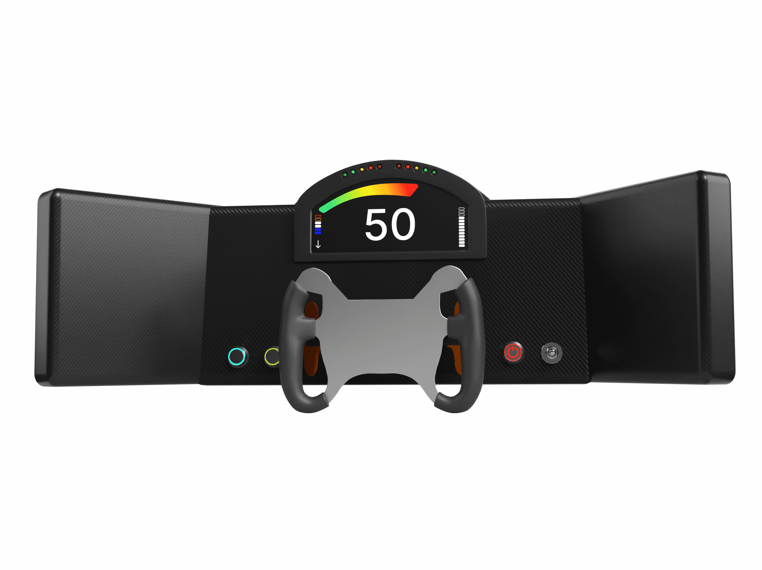
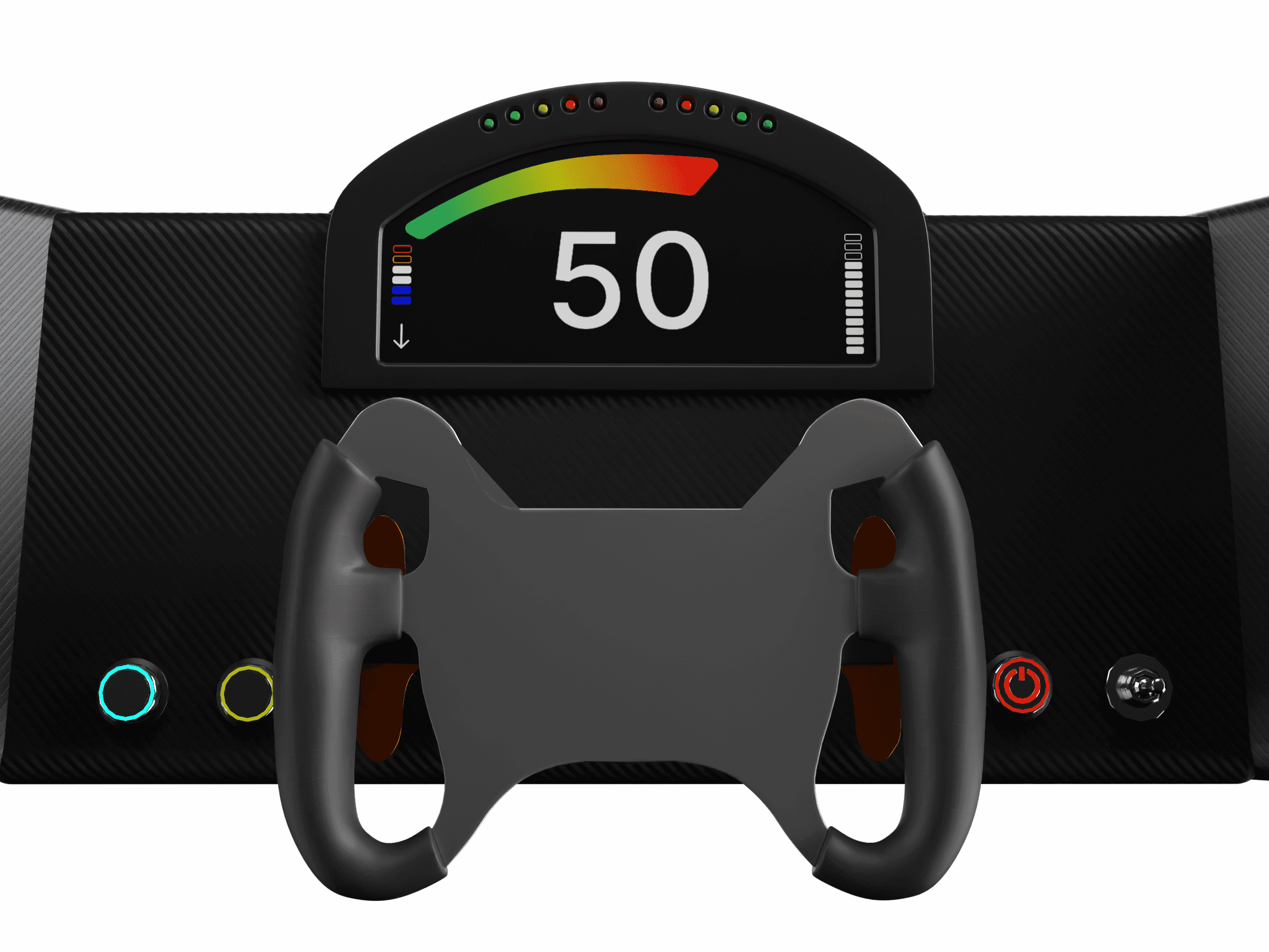
It was found that the reflective properties of the resin were not causing any visual impairments. No Vantablack was needed.
Steering
It was found that partial handles were both personally preferred by our drivers and provided better ingress/egress. Adding controls to steering would have compromised its quick-release capabilities and therefore was not a viable option.
Controls
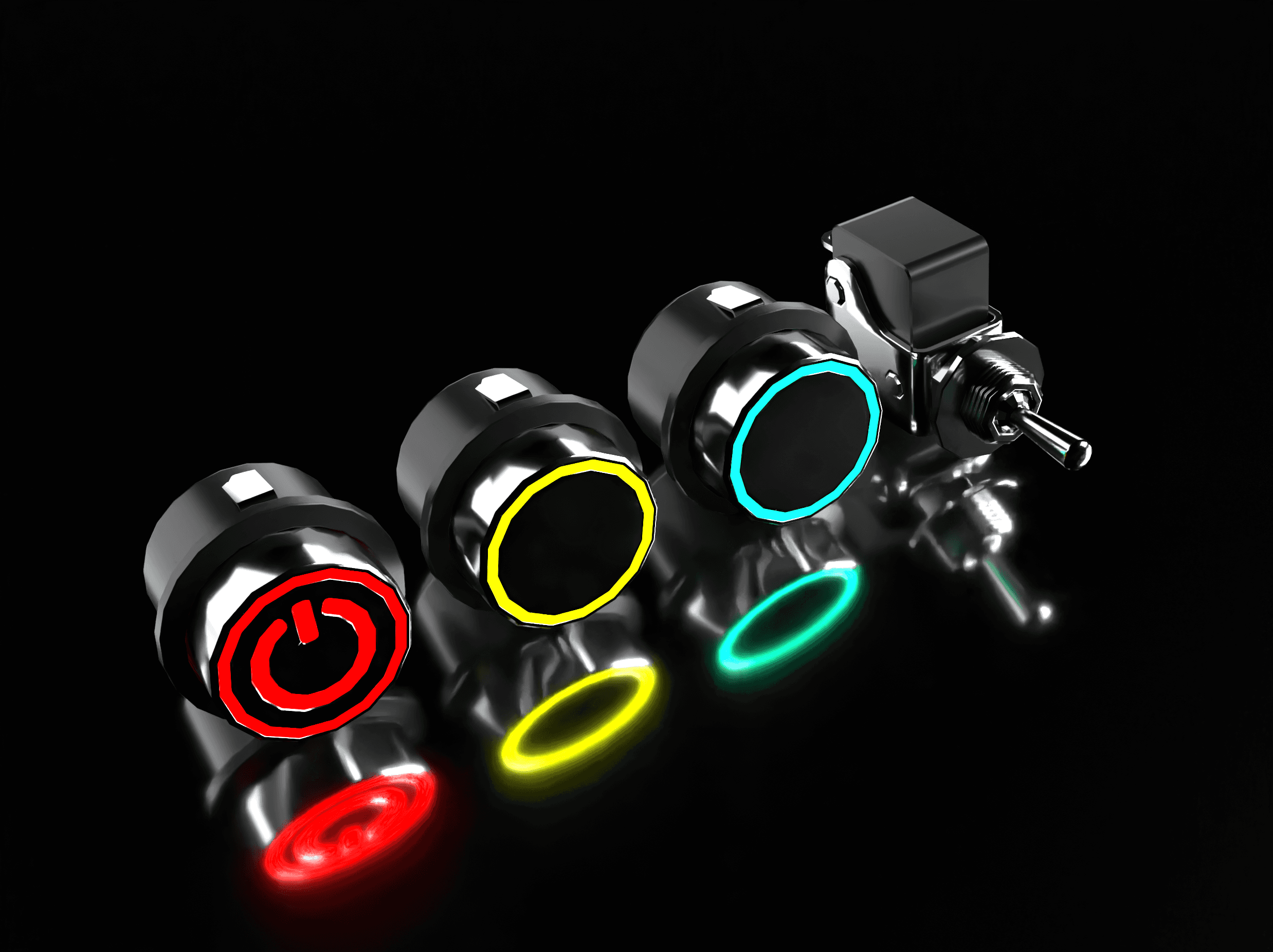
Both ignition and display states are easily distinguishable even without checking the instrument panel. However, accidental toggling of these controls could lead to catastrophic errors. Therefore, illuminated buttons are deemed more suitable for these functions.
The fan switch was given a toggle since it's less intuitive to discern if the fan is running without a visual indicator, and accidental toggling would have a lesser impact compared to other controls.
Our over-the-air performance communications system didn't necessitate a continuous development (CI/CD) approach. Instead, a batch approach was deemed appropriate for sending performance data to our servers. Thus, a button was chosen for this function.
GUI
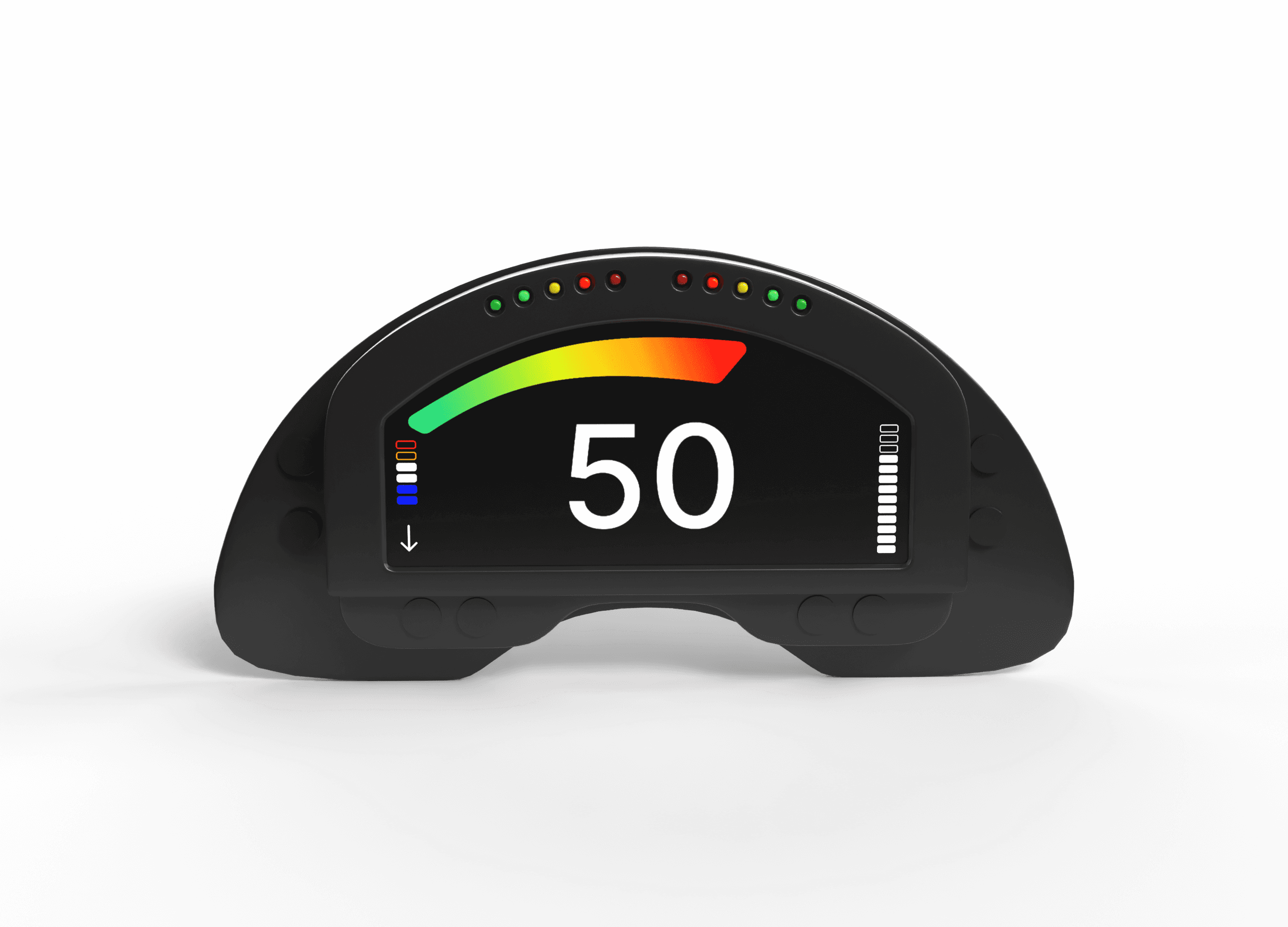
Drivers expressed a preference for minimal information (speed, power, critical alerts) presented in large font with high contrast. Weight reduction is also a key consideration. While both options meet these criteria, LCDs offer sufficient contrast ratios at a lower cost. Thus, an LCD screen was deemed sufficient.










Conclusion
While the research and wireframes from 2018 hold strong, the design itself needed a refresh to incorporate more modern tools. With the use of Adobe Dimension, Blender, and Figma, this concept is able to reach a much higher fidelity.
While the research and wireframes from 2018 hold strong, the design itself needed a refresh to incorporate more modern tools. With the use of Adobe Dimension, Blender, and Figma, this concept is able to reach a much higher fidelity.
While the research and wireframes from 2018 hold strong, the design itself needed a refresh to incorporate more modern tools. With the use of Adobe Dimension, Blender, and Figma, this concept is able to reach a much higher fidelity.
Impact
This project was pivotal in my learning how to communicate with engineers effectively as a designer. I learned a vast amount of empathy for the engineering design process by throwing myself directly into it. While this project resulted in an intuitive and user-friendly instrument panel, it also begun a larger conversation amongst the team of how UX can blend with Engineering in the future.
This project was pivotal in my learning how to communicate with engineers effectively as a designer. I learned a vast amount of empathy for the engineering design process by throwing myself directly into it. While this project resulted in an intuitive and user-friendly instrument panel, it also begun a larger conversation amongst the team of how UX can blend with Engineering in the future.
This project was pivotal in my learning how to communicate with engineers effectively as a designer. I learned a vast amount of empathy for the engineering design process by throwing myself directly into it. While this project resulted in an intuitive and user-friendly instrument panel, it also begun a larger conversation amongst the team of how UX can blend with Engineering in the future.
More projects
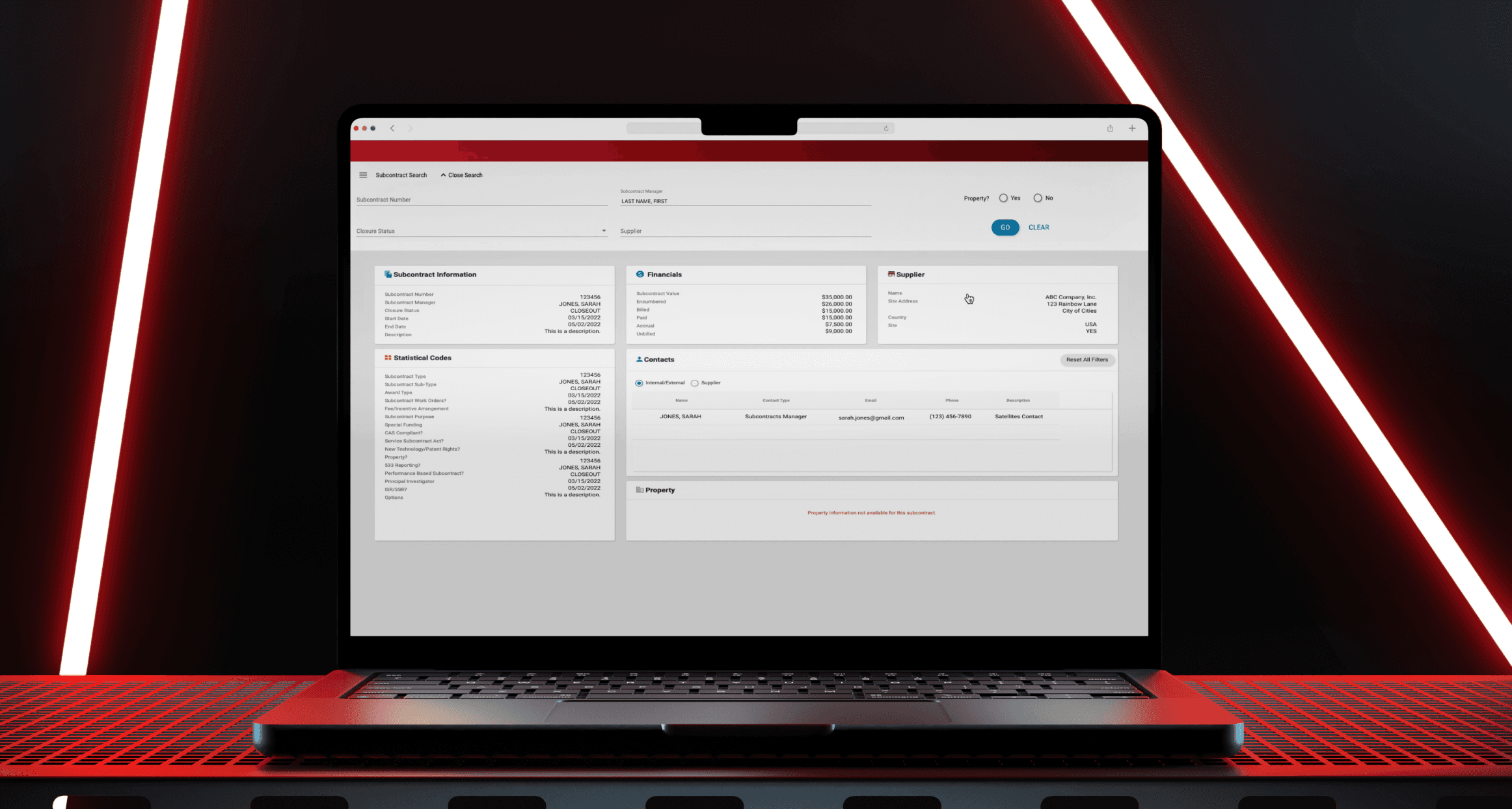
An Executive Enterprise application, redesigned.
NASA JPL Subcontracts Wizard
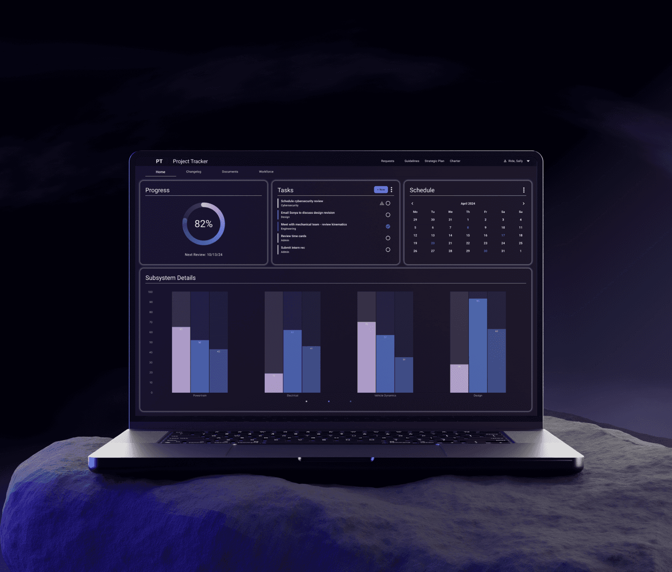
The digital design system for JPL's internal software.
NASA JPL Design System

An Executive Enterprise application, redesigned.
NASA JPL Subcontracts Wizard

The digital design system for JPL's internal software.
NASA JPL Design System
Contact
Let’s start a conversation
Contact
Let’s start a conversation
Contact
Let’s start a conversation