Emma Kalayjian
Menu
Emma Kalayjian
Menu
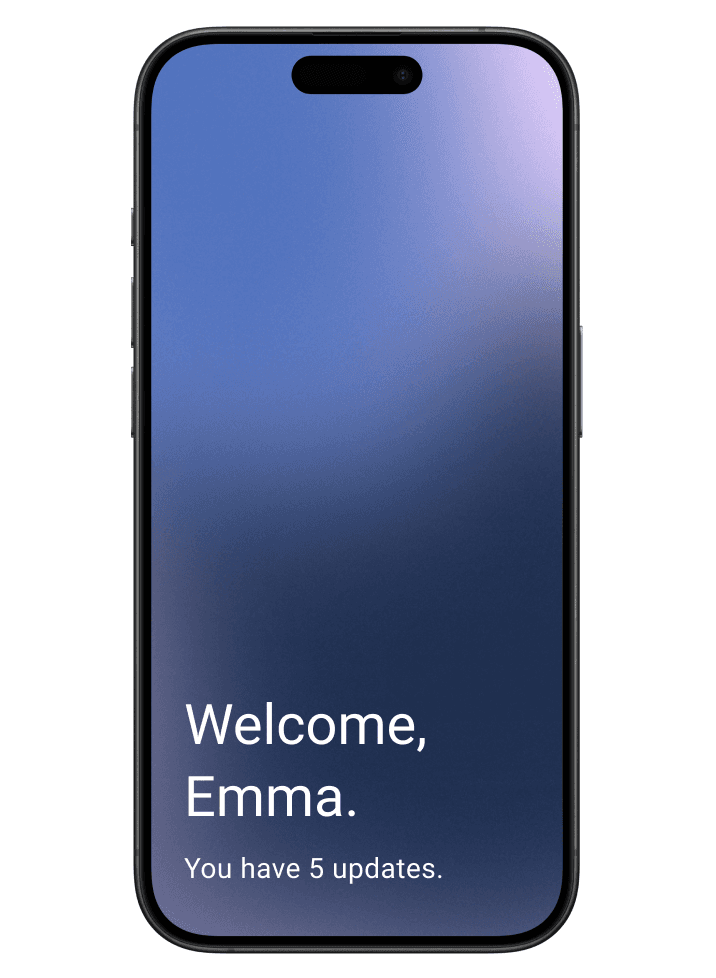
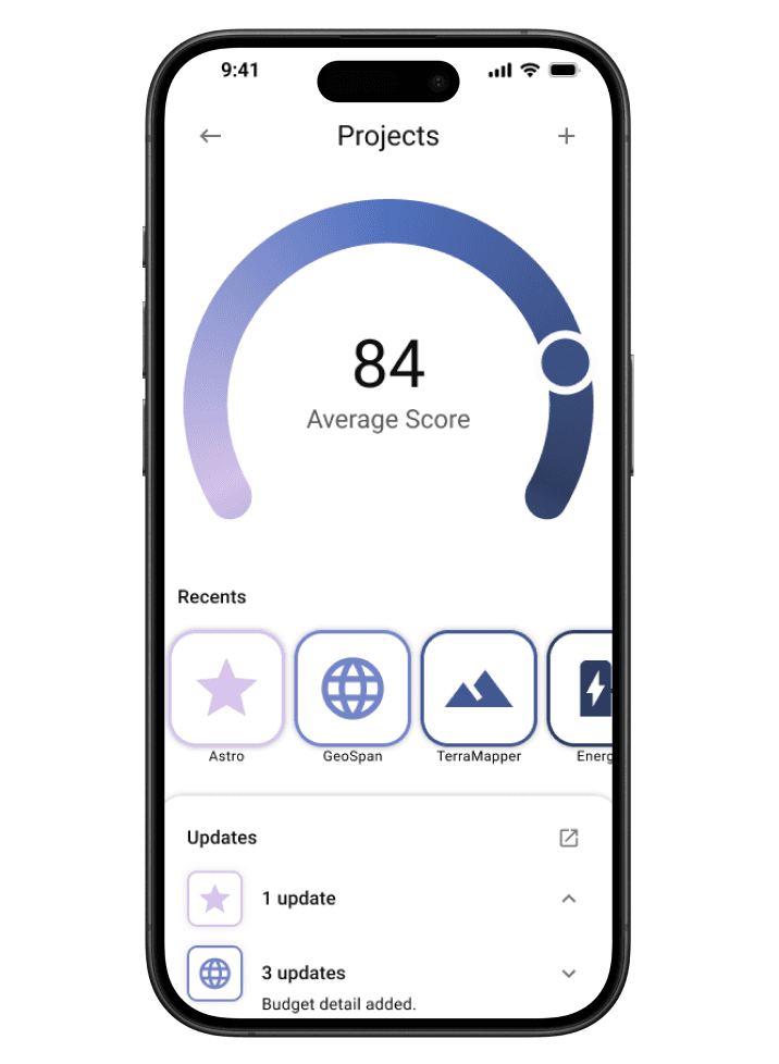
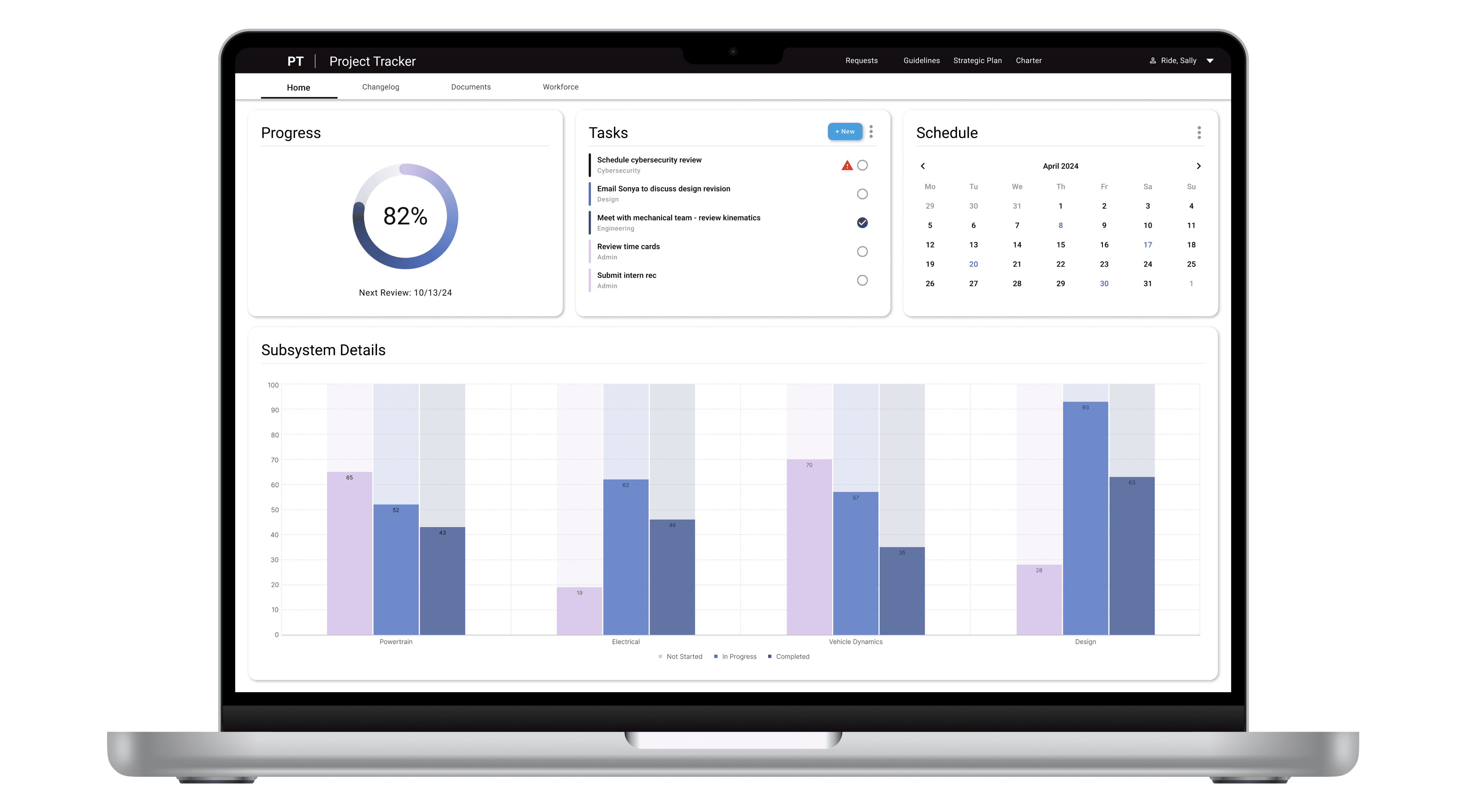
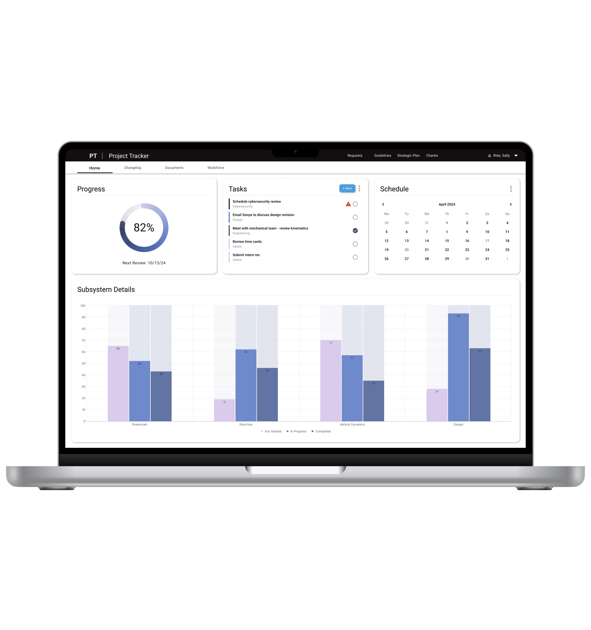
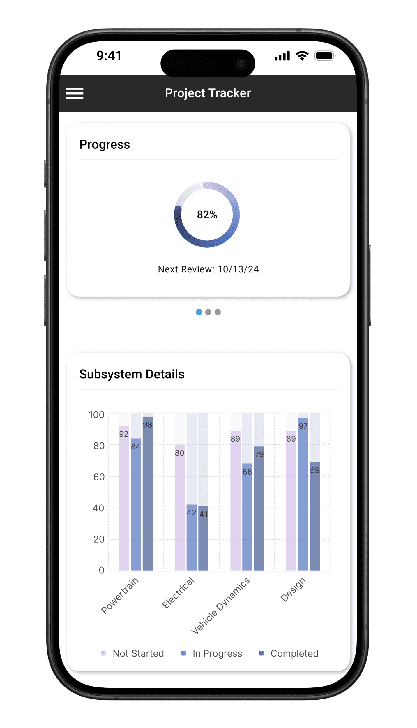
The digital design system for JPL's internal software.
NASA JPL Design System
The digital design system for JPL's internal software.
NASA JPL Design System
The digital design system for JPL's internal software.
NASA JPL Design System
About
Full presentation available on Behance.
Proxima is the Digital Design System for NASA JPL’s Enterprise Web, Mobile and Desktop applications.
We chose to name the this project "Proxima" after the star, Proxima Centauri.
Awards
NASA JPL Team Award
NASA JPL Team Award
NASA JPL Team Award
Tools
Microsoft Suite, Figma, GitHub, VS Code
Microsoft Suite, Figma, GitHub, VS Code
Microsoft Suite, Figma, GitHub, VS Code
My Contributions
Lead UI Designer, Research Supervisor
Lead UI Designer, Research Supervisor
Lead UI Designer, Research Supervisor
Company
NASA Jet Propulsion Laboratory, California Institute of Technology
Skillset
Design Systems, User Research, Visual Design, UI Design
Timeframe
1 year (2020)
Team
Emma Kalayjian, Paul Lumsdaine, Stephanie Contreras, Christy Liao, Zachary Young, Emily Dung
Problem
Developers expressed frustration with having to continually recreate UI components from scratch (header, footer, etc.) for each new project, resulting in lots of extra time being spent recreating the same components repeatedly...ultimately to create a non-cohesive digital experience for end users. Thus, the need for a design system had been sparked.
Developers expressed frustration with having to continually recreate UI components from scratch (header, footer, etc.) for each new project, resulting in lots of extra time being spent recreating the same components repeatedly...ultimately to create a non-cohesive digital experience for end users. Thus, the need for a design system had been sparked.
Developers expressed frustration with having to continually recreate UI components from scratch (header, footer, etc.) for each new project, resulting in lots of extra time being spent recreating the same components repeatedly...ultimately to create a non-cohesive digital experience for end users. Thus, the need for a design system had been sparked.
Questions
What components, if any, do all digital applications share?
Of these shared components, can we create a digital component library that is both accessible for our end users *and* intuitive for our developers to implement?
What components, if any, do all digital applications share?
Of these shared components, can we create a digital component library that is both accessible for our end users *and* intuitive for our developers to implement?
What components, if any, do all digital applications share?
Of these shared components, can we create a digital component library that is both accessible for our end users *and* intuitive for our developers to implement?
Process
Research
Interviews
Perform full panel suite of interviews with Software Engineers, Enterprise Systems Analysts, and Project Managers
Synthesize Raw Data
Create personas, empathy maps & journey maps based on research data
Create Checklists
Create list of technical requirements, user requirements, and site architecture from the UX research artifacts
Research Accessibility
Research accessibility guidelines to ensure compliance with both WCAG AA 2.1 and Section 508
Design
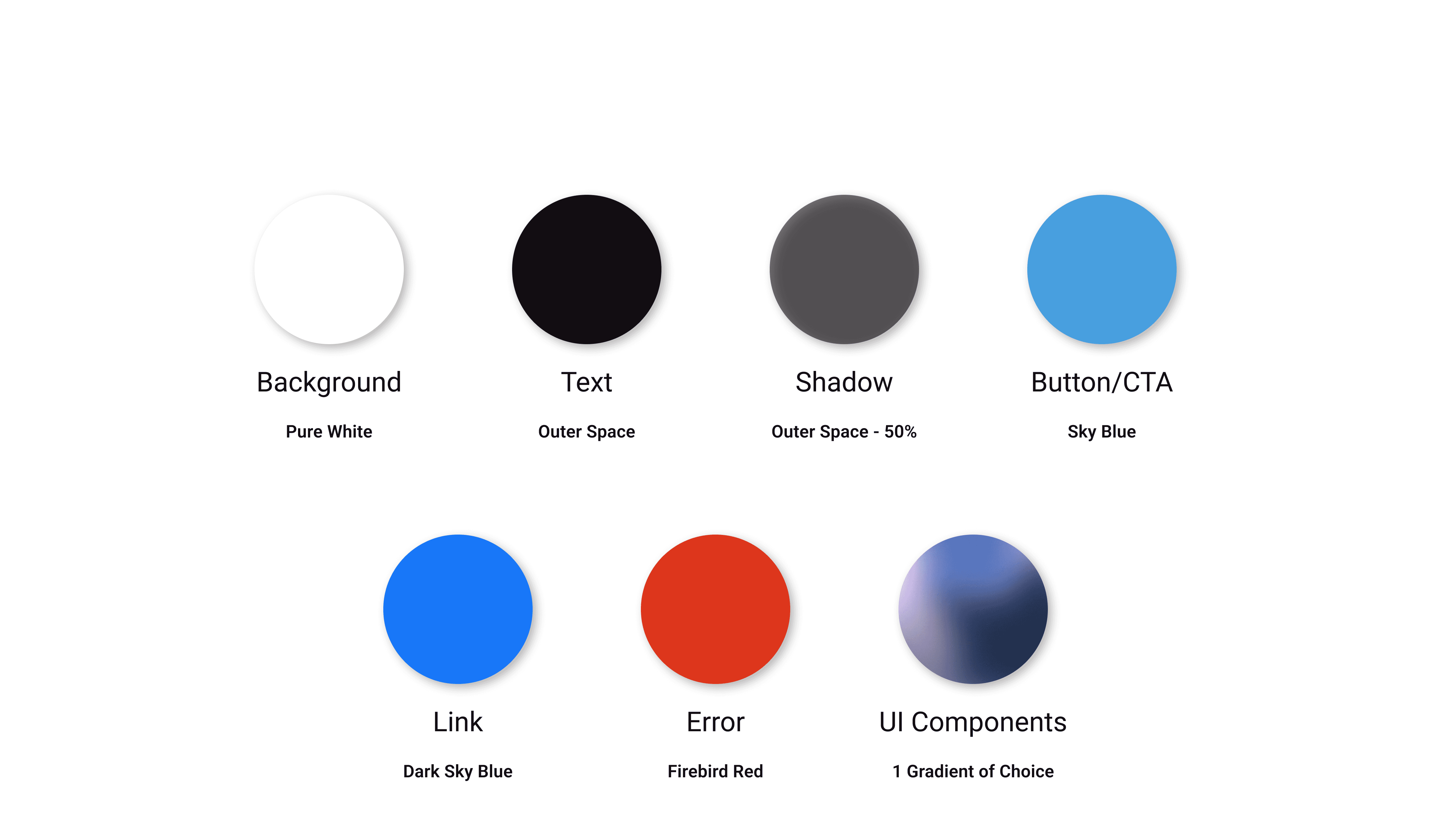
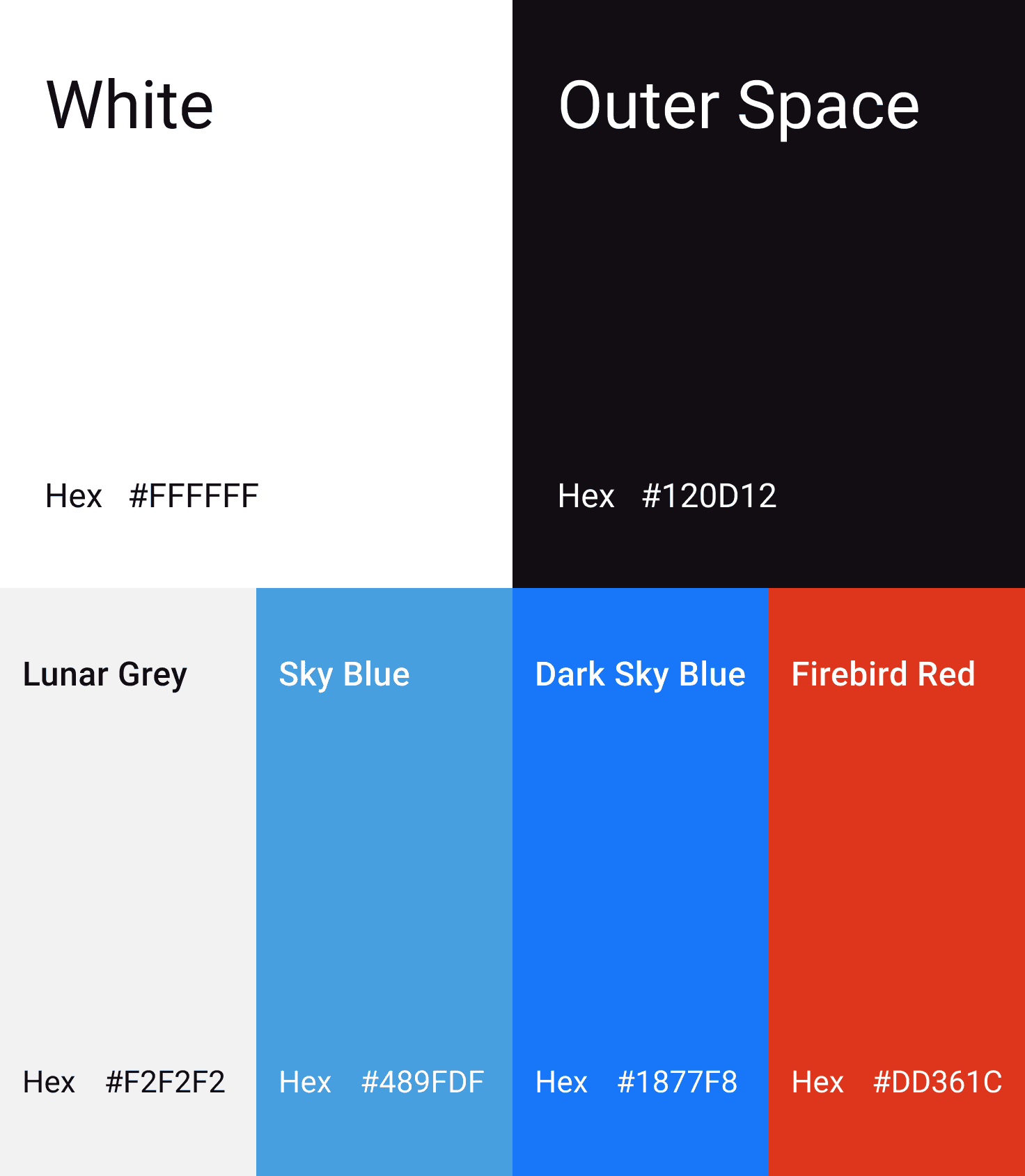
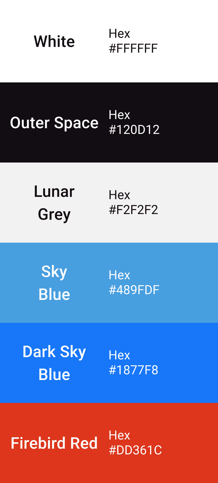
Design Color System
Create color system to be in compliance with all accessibility requirements & align with branding requirements of our three governing brands: NASA, Caltech, and JPL
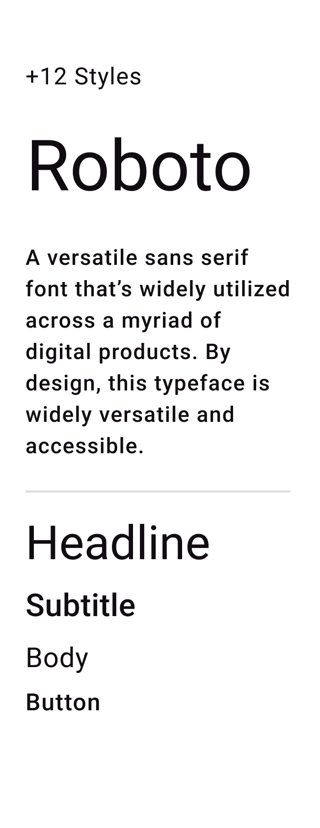
Design Typography
Research and select ideal font system to support all use cases and accessibility compliance
Design Shading System
Design combinations of gradients, drop shadows and lighting environments to bring the components to life.
Design Components
Design 35 full components, plus their variants, incorporating all created design elements and interactions
Design UI Layouts
Create a handful of layouts that developers could use out of the box for their applications, with all interactions pre-baked and ready to go.
Develop
Develop Schematics
Instantiate the EBIS Schematics Library on GitHub where the code for specific application compliance lives
Create Repository
Fully develop the EBIS Component Library on GitHub to ensure capability across the Division’s active applications
Develop Components
Utilize VS Code to develop components, then merge into the dev branch on the EBIS Component Library Repository
Launch
Proxima is live
Research
Interviews
Perform full panel suite of interviews with Software Engineers, Enterprise Systems Analysts, and Project Managers
Synthesize Raw Data
Create personas, empathy maps & journey maps based on research data
Create Checklists
Create list of technical requirements, user requirements, and site architecture from the UX research artifacts
Research Accessibility
Research accessibility guidelines to ensure compliance with both WCAG AA 2.1 and Section 508
Design
Design Color System
Create color system to be in compliance with all accessibility requirements & align with branding requirements of our three governing brands: NASA, Caltech, and JPL
Design Typography
Research and select ideal font system to support all use cases and accessibility compliance
Design Shading System
Design combinations of gradients, drop shadows and lighting environments to bring the components to life.
Design Components
Design 35 full components, plus their variants, incorporating all created design elements and interactions
Design UI Layouts
Create a handful of layouts that developers could use out of the box for their applications, with all interactions pre-baked and ready to go.
Develop
Develop Schematics
Instantiate the EBIS Schematics Library on GitHub where the code for specific application compliance lives
Create Repository
Fully develop the EBIS Component Library on GitHub to ensure capability across the Division’s active applications
Develop Components
Utilize VS Code to develop components, then merge into the dev branch on the EBIS Component Library Repository
Launch
Proxima is live
Highlights
I was Co-Lead of this project, along with our team's Senior Designer. We also had a few UX Research summer interns. At a high level, here's what I did:
1. With our Senior Designer, interview and select our intern hires for the summer.
2. Lead our interns with their research development, hold check-in meetings with them to review and assess findings.
(Why have interns do the research? Part of the problem was that I personally was already so familiar with the issue and, in part, shared similar frustrations as the developers. We hired UX Research interns so that someone with an outside perspective could give an objective assessment and either confirm or challenge initial beliefs.)
3. Review research findings with interns and translate them into design requirements.
4. Research accessibility for compliance.
5. Attend Art Center College of Design - Extension Program for a course in Visual Communications to better understand dynamic lighting and how to create a sense of depth in the interface by using various lighting and shading techniques.
6. Design entire color system and shading system myself, and co-design components with our Senior Designer.
7. Run accessibility checks and make code adjustment as seen fit.
8. Work with development team to co-create components and ensure accurate interaction design.
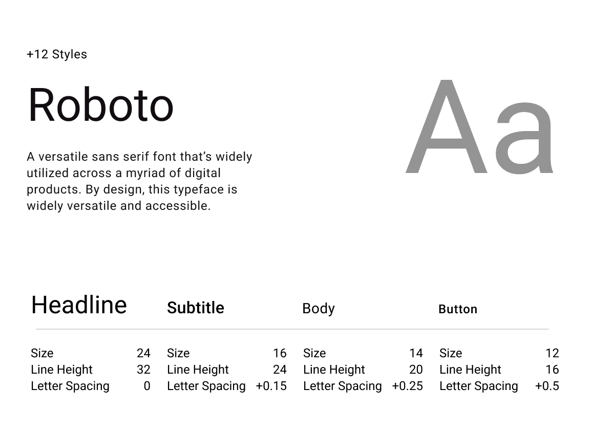
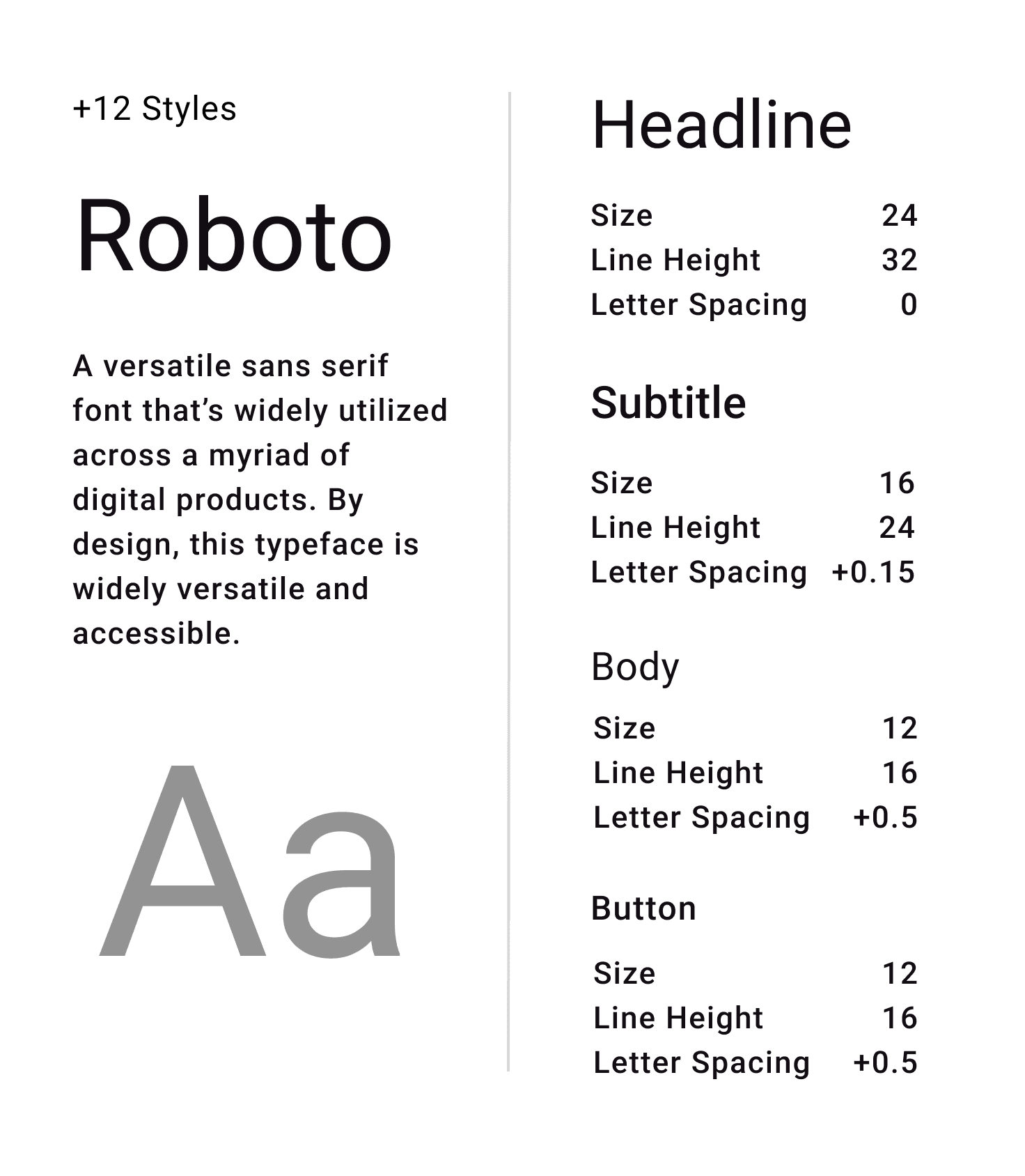
From top to bottom: Typography, Color Guide, Component Details, Light Mode & Dark Mode
From top to bottom: Typography, Color Guide, Component Details, Light Mode & Dark Mode
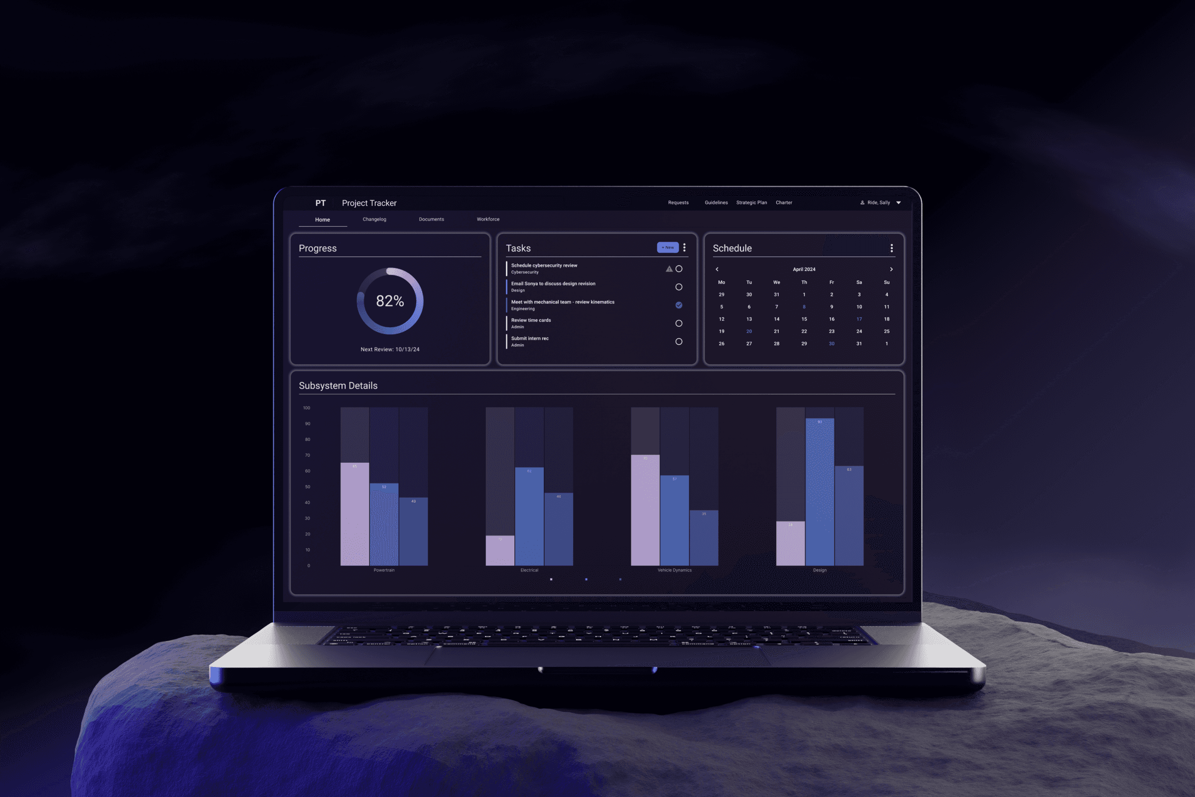
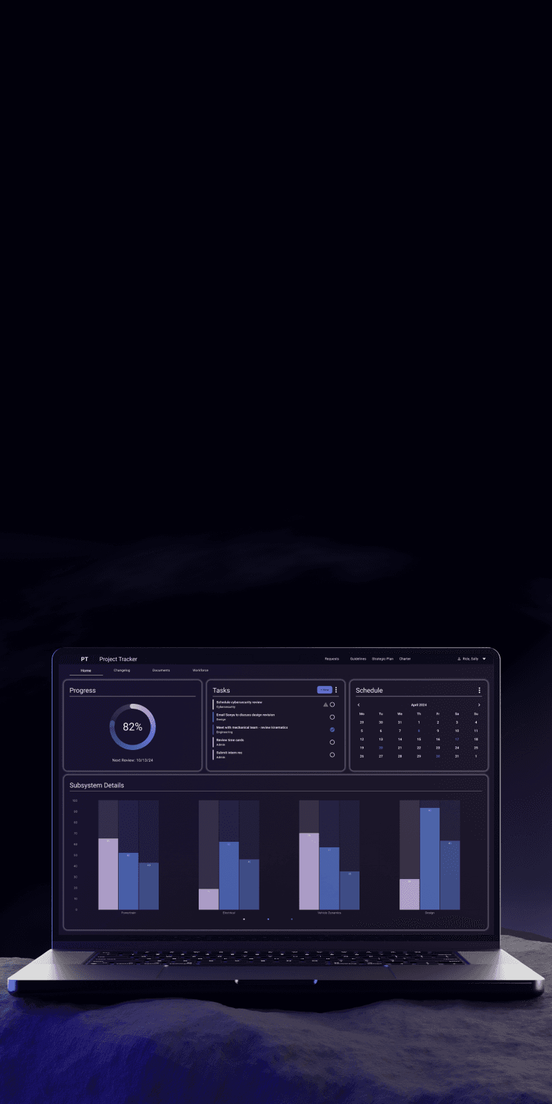
Landing, Project Overview & Project Detail
Landing, Project Overview & Project Detail
Conclusion
The final result: an award-winning, accessible, digital component library for developers to download and implement into their applications in order to both save time and create a cohesive brand experience across 3 frameworks.
The final result: an award-winning, accessible, digital component library for developers to download and implement into their applications in order to both save time and create a cohesive brand experience across 3 frameworks.
The final result: an award-winning, accessible, digital component library for developers to download and implement into their applications in order to both save time and create a cohesive brand experience across 3 frameworks.
35 fully accessible components
1 JPL Team Award
30% estimated development time saved per project
30% estimated development time saved per project
3 frameworks (Angular, React, Vue)
2 platforms (Desktop, Mobile)
3 frameworks (Angular, React, Vue)
2 platforms (Desktop, Mobile)
35 fully accessible components
1 JPL Team Award
Impact
Our final product was the Proxima Design System offering 35 fully accessible components in 3 frameworks: Angular, React, and Vue. Once Proxima went live and project teams began implementing it into their project pipeline, developers reported back an estimated 30% time saved per project due to no longer having to recreate these core components.Proxima also was the recipient of a JPL Team Award.
Our final product was the Proxima Design System offering 35 fully accessible components in 3 frameworks: Angular, React, and Vue. Once Proxima went live and project teams began implementing it into their project pipeline, developers reported back an estimated 30% time saved per project due to no longer having to recreate these core components.Proxima also was the recipient of a JPL Team Award.
Our final product was the Proxima Design System offering 35 fully accessible components in 3 frameworks: Angular, React, and Vue. Once Proxima went live and project teams began implementing it into their project pipeline, developers reported back an estimated 30% time saved per project due to no longer having to recreate these core components.Proxima also was the recipient of a JPL Team Award.
More projects
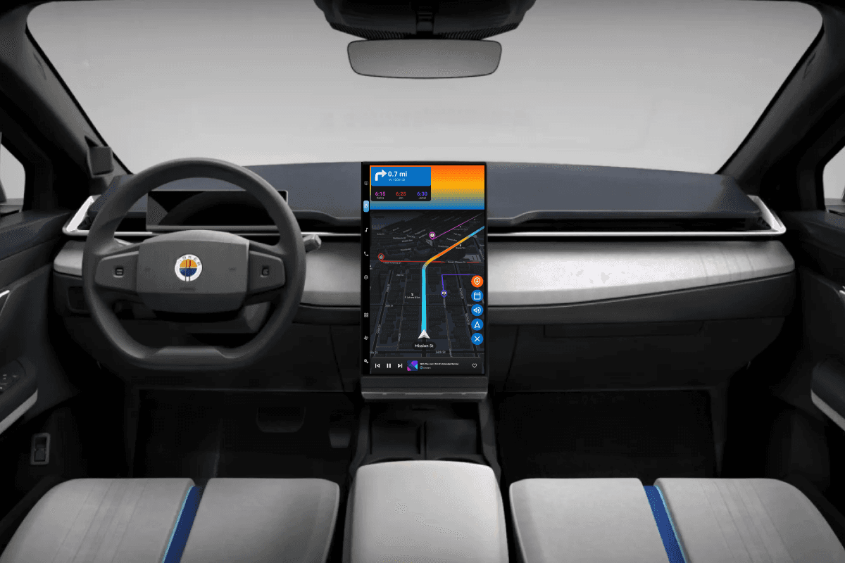
Colorblind-friendly UI + VUI to reduce cognitive load.
Fisker Ocean User Interface
When engineers and designers harmonize.
NASA JPL Autonomy Testbed Paper
Colorblind-friendly UI + VUI to reduce cognitive load.
Fisker Ocean User Interface
When engineers and designers harmonize.
NASA JPL Autonomy Testbed Paper
Contact
Let’s start a conversation
Contact
Let’s start a conversation
Contact
Let’s start a conversation