Emma Kalayjian
Menu
Emma Kalayjian
Menu

An Executive Enterprise application, redesigned.
NASA JPL Subcontracts Wizard
An Executive Enterprise application, redesigned.
NASA JPL Subcontracts Wizard

An Executive Enterprise application, redesigned.
NASA JPL Subcontracts Wizard
About
Full presentation available on Behance.
Subcontracts Wizard is an Enterprise application for the Acquisition Division to manage all active and archived subcontracts used to document purchasing transactions, from office supplies to flight hardware.
Awards
JPL Team Award
JPL Team Award
JPL Team Award
Tools
Figma, GitHub, Lyssna
Figma, GitHub, Lyssna
Figma, GitHub, Lyssna
My Contributions
User research, color theory, branding, information architecture, interaction design, usability testing, UAT, A/B testing, heatmap testing, front-end development
User research, color theory, branding, information architecture, interaction design, usability testing, UAT, A/B testing, heatmap testing, front-end development
User research, color theory, branding, information architecture, interaction design, usability testing, UAT, A/B testing, heatmap testing, front-end development
Company
NASA Jet Propulsion Laboratory
Skillset
IA Design, UI Design, User Testing
Timeframe
March 2020 - April 2021
Team
Emma Kalayjian, Serena Villacorta, Rita Nassif, Vahe Kilamyan
Problem
The former design has existed for decades, which means both the design and technical infrastructure needed to be upgraded.
The challenge was to design an interface that:
Complies with Accessibility standards (Section 508, WCAG 2.1 AA)
Implements JPL Design Lab's Design & Branding Guidelines
Offers a clean, concise information architecture that reduces cognitive load.
Questions
What is the optimal information architecture for users to access all subcontract information with minimal number of clicks?
How can both the front-end and back-end be modernized to be up to date without alienating our existing user base?
What is the optimal information architecture for users to access all subcontract information with minimal number of clicks?
How can both the front-end and back-end be modernized to be up to date without alienating our existing user base?
What is the optimal information architecture for users to access all subcontract information with minimal number of clicks?
How can both the front-end and back-end be modernized to be up to date without alienating our existing user base?
Process
Heuristic Evaluation
Perform heuristic evaluation of existing application by comparing current state to Nielsen Norman Group's 10 Usability Heuristics
Personas
Full panel suite of interviews with users and stakeholders.
7 unique personas identified.
Journey Maps
Perform journey maps for the 7 identified personas to identify and isolate pain points. 14 unique pain points found.
Architecture Mapping
Evaluate current information architecture map, eliminate erroneous layers and reorganize to optimize page layers
LoFi Mockups
Create low fidelity mockups in an iterative process to confirm ideal page/site layout
HiFi Mockups
Create high fidelity mockups to confirm more intricate UI details
Testing
Conduct User Acceptance Testing (UAT), Heat Map Testing, and A/B Testing with various volunteer users on full-scale prototypes.
Conduct accessibility scans across all layers of the UI to ensure the app is in compliance with WCAG 2.1 AA Guidelines.
Heat map tests were distributed as part of the A/B testing to measure the effectiveness of two different designs for the search component.
Highlights
Revamped information architecture so that the data is streamlined and easily obtainable
Eliminated all erroneous pages/links, down from 5 layers to 3
Upgraded and streamlined UI to be clean, concise, and accessible
End users report an overall efficiency improvement of at least 30% and high satisfaction


From top to bottom: one of four journey maps, heatmap from UAT, old site architecture and improved site architecture
From top to bottom: one of four journey maps, heatmap from UAT, old site architecture and improved site architecture

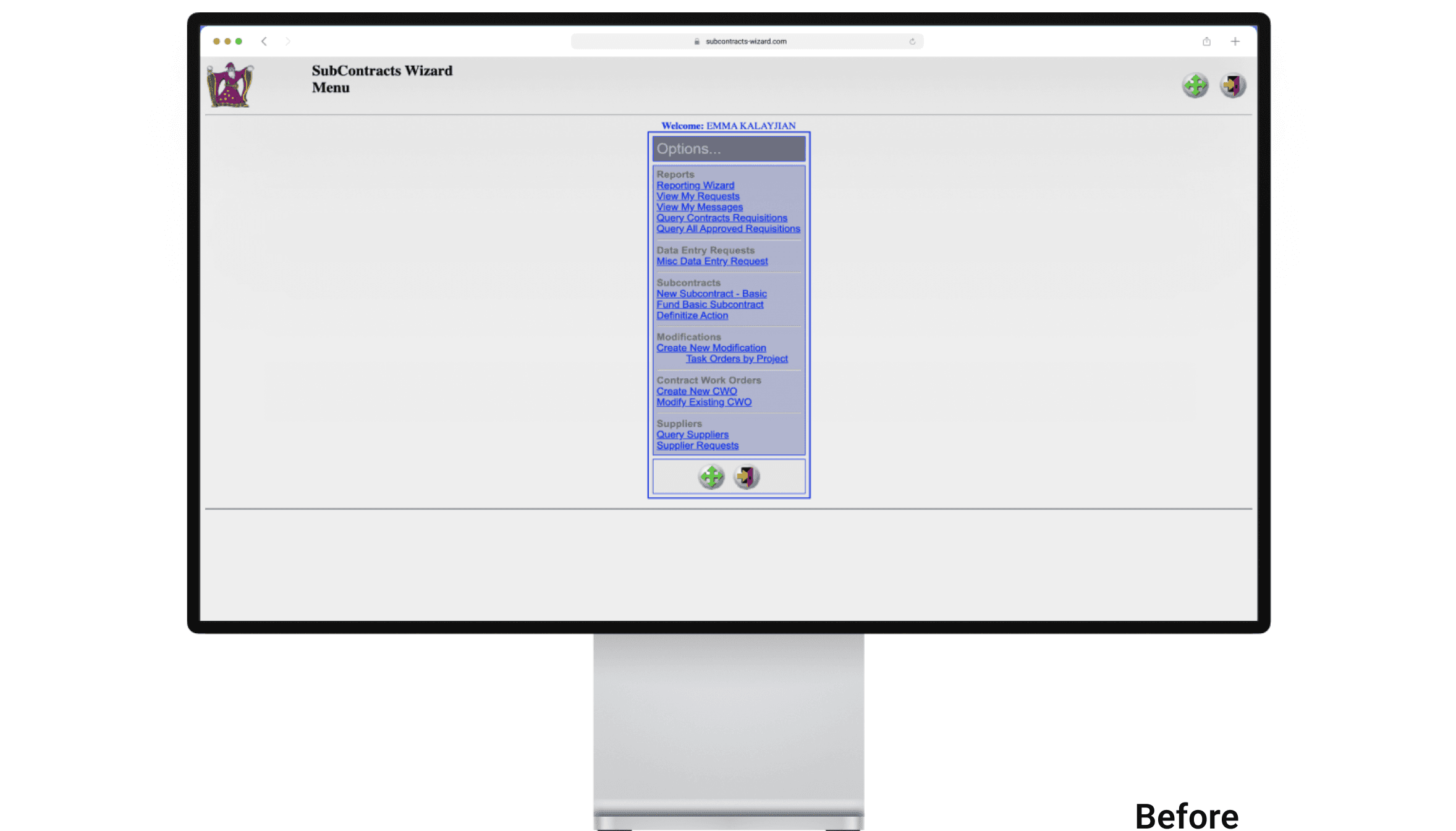


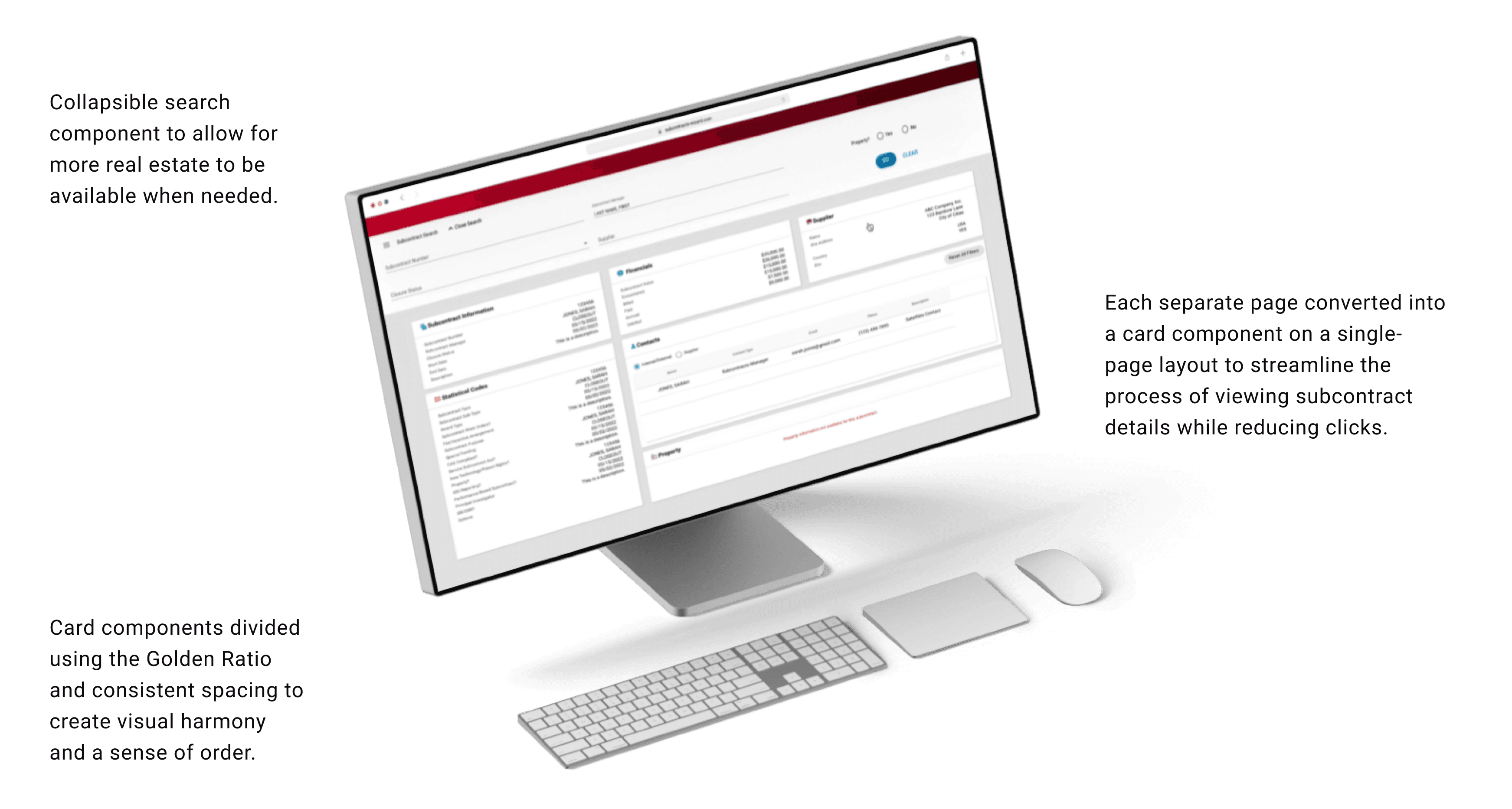


Before & After
Before & After
Conclusion
This technical upgrade offered several challenges: cleaning up the backend, improving response time, and creating a UI that isn't a headache, respectively. Meanwhile, we have users who have been used to the old design for the past 20+ years, so we had to be mindful that the redesign should encourage healthy familiarity so as not to alienate our user base.
As a result, we came up with a new and improved web application that addressed all core concerns while maintaining enough architectural familiarity for the existing users.
1 JPL Team Award
Information Architecture streamlined from 5 layers to 3
Information Architecture streamlined from 5 layers to 3
Seamless user transition due to intuitive UI
Seamless user transition due to intuitive UI
1 JPL Team Award
Impact
This redesign has since greatly improved the work experience and efficiency for subcontracts managers. Close to 75% have reported high levels of satisfaction.
This redesign has since greatly improved the work experience and efficiency for subcontracts managers. Close to 75% have reported high levels of satisfaction.
This redesign has since greatly improved the work experience and efficiency for subcontracts managers. Close to 75% have reported high levels of satisfaction.
More projects
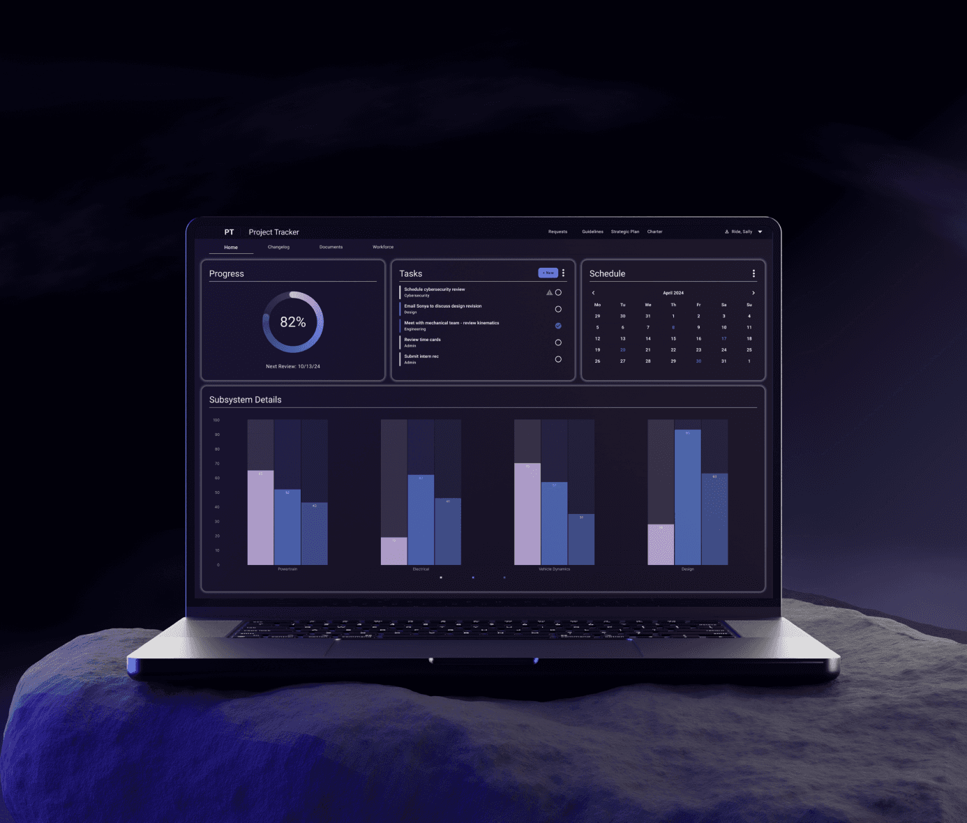
The digital design system for JPL's internal software.
NASA JPL Design System
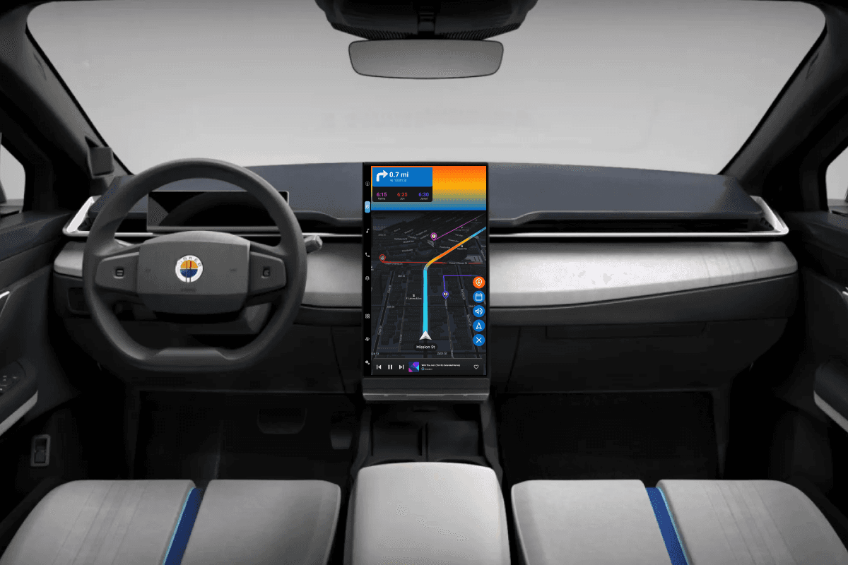
Colorblind-friendly UI + VUI to reduce cognitive load.
Fisker Ocean User Interface
The digital design system for JPL's internal software.
NASA JPL Design System
Colorblind-friendly UI + VUI to reduce cognitive load.
Fisker Ocean User Interface
Contact
Let’s start a conversation
Contact
Let’s start a conversation
Contact
Let’s start a conversation